ADVERTISEMENT
I still think it looks like a Star Wars droid. pic.twitter.com/WptnUGlxvd
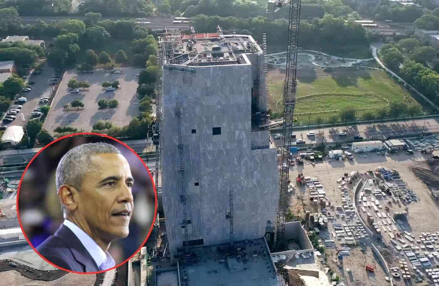
The building is meant to symbolize four hands coming together in unity. If you don’t see that when you look at it, don’t worry; no one else does either. The exterior features words from one of Obama’s speeches, but they’re displayed so poorly that it’s difficult to read them, which reflects poorly on Obama himself.
Interestingly, he was very involved in the design process, which may explain the building’s unappealing appearance. The designers confirmed the extent of his involvement:
ADVERTISEMENT
